No Single Metric to Rule Them All
One metric can't tell the whole story.

A month ago one of our product teams started receiving complains about the quality of their work. "Too much defects and way too long time to fix" was the comment. This was interesting, as at least at first glance, we have not changed much. No new joiners or leavers in that team, no process changes, working with the same architecture and stack.
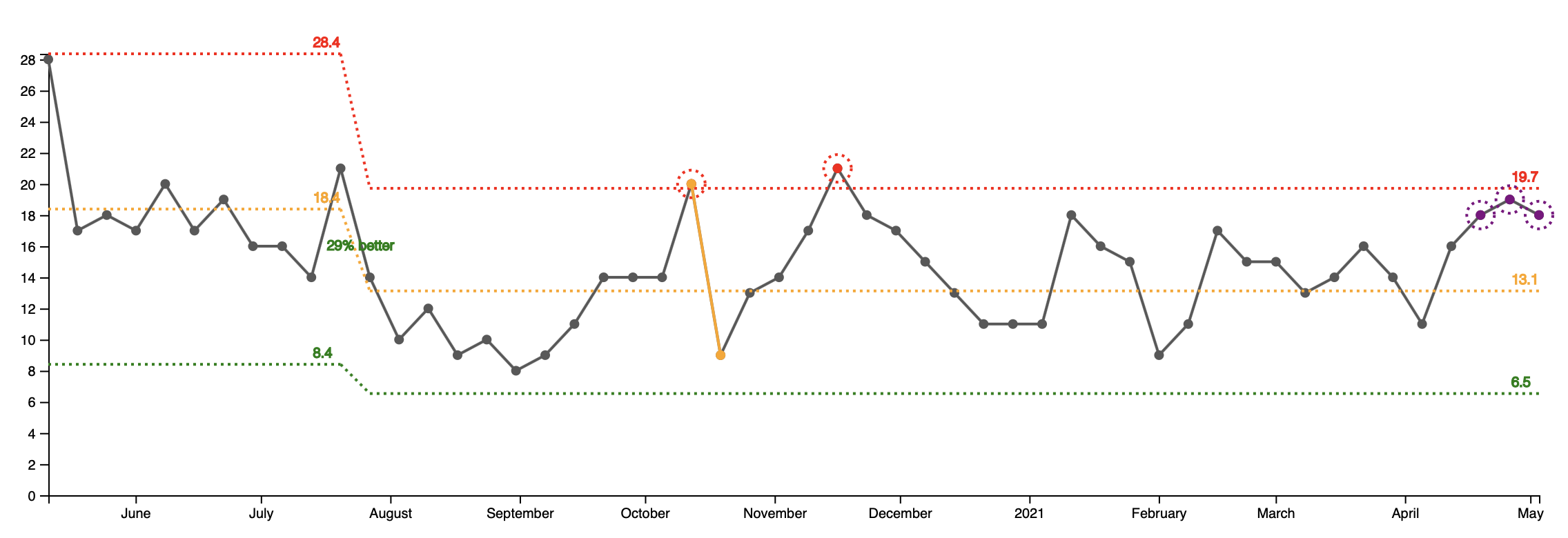
Naturally one would look at the incoming support tickets graph for that team to figure out if they are producing more defects.
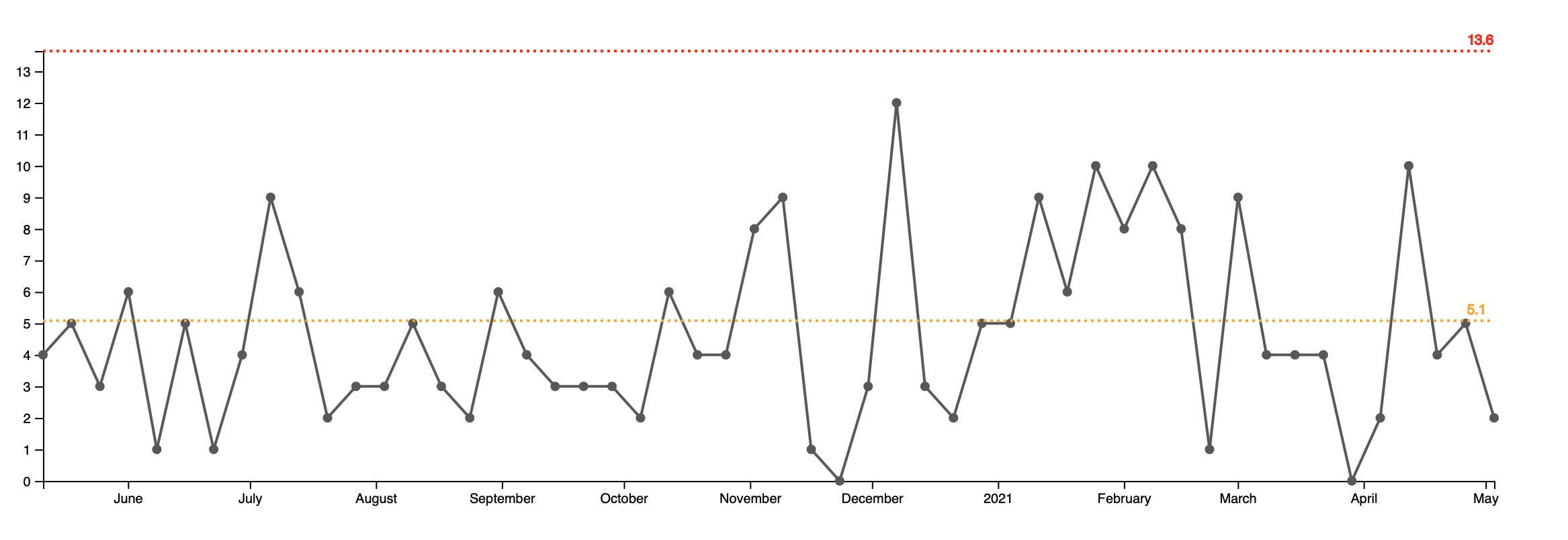
What looks like an uptick in mid January to mid February (6 consecutive points above the average line) is actually a normal variation of the process. The process in fact, was stable for the past year. On average this team was receiving five support tickets per week.
(If you’re interested how this and the next graphs were created and what is the red dotted line, check the “Measuring Quality” talk for detailed explanation.)
If the flow of new support tickets was, on average, the same in the past year, then why the support team was insisting that the quality was getting worse? Looking at the next graph gave us a hint.
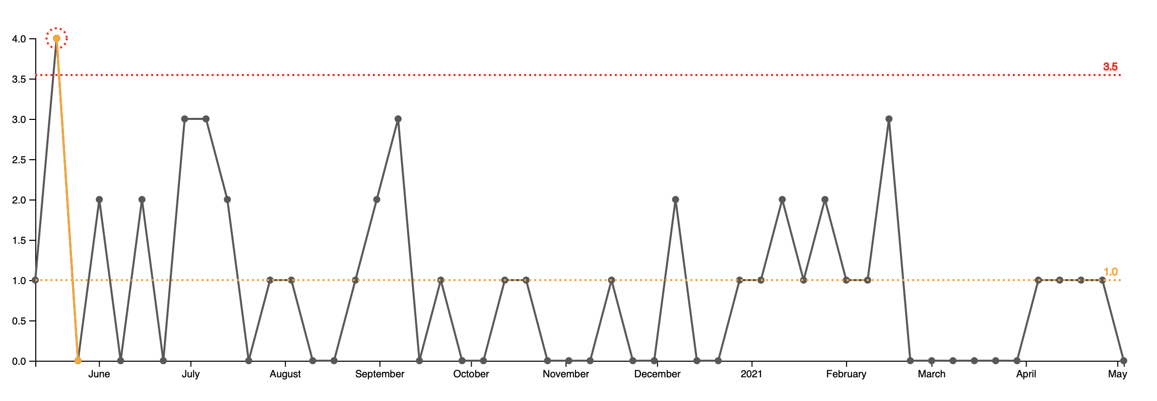
It shows how many hotfixes this team is releasing each week. Naturally, not all of the support tickets end up as hot fixes. At Falcon.io this number hovers around 20%. The other 80% of the support tickets do not require a fix. The reasons why vary: outdated documentation, insufficient customer training, an outage outside of our control etc.
But still we have to do some hotfixes. Customer complains are arriving at the same rate for the past year. The graph shows that for six week - including the whole March the team did not do any hotfixes. This has never happened in the past year.
Deprioritizing hotfixes was a conscious decision. We had to work important feature with specific deadline and this put the support requests on the back burner.
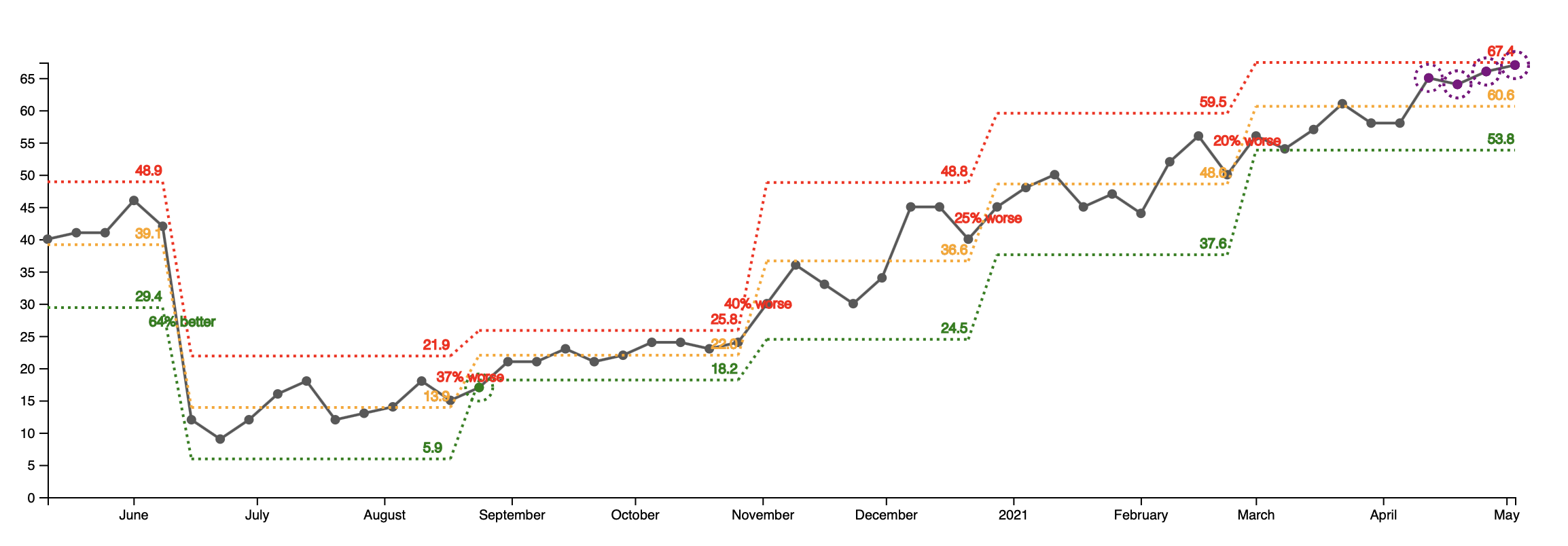
The third graph is even more telling. It shows the currently open support tickets. Starting from the lowest point in the summer of 2020 with 14 open tickets per week, we’re now at a peak of 66 open tickets per week - almost 5x times.
As a result of not acively working on the support tickets, the time to close has increased with 65% since December. The cycle time increase is a direct result from Little's Law and is explained in details in the wonderful book The Principles of Product Develpment Flow.
So the quality did not get worse per se. We just stopped paying our debt. Then the resolution time increased. Various customer started complaining for the same problems and about how "fast" we're fixing them.
Long term this is not sustainable, but as noted above, it was a conciosus decision. Similar to technical debt, we now have to start going through the backlog of support requests.
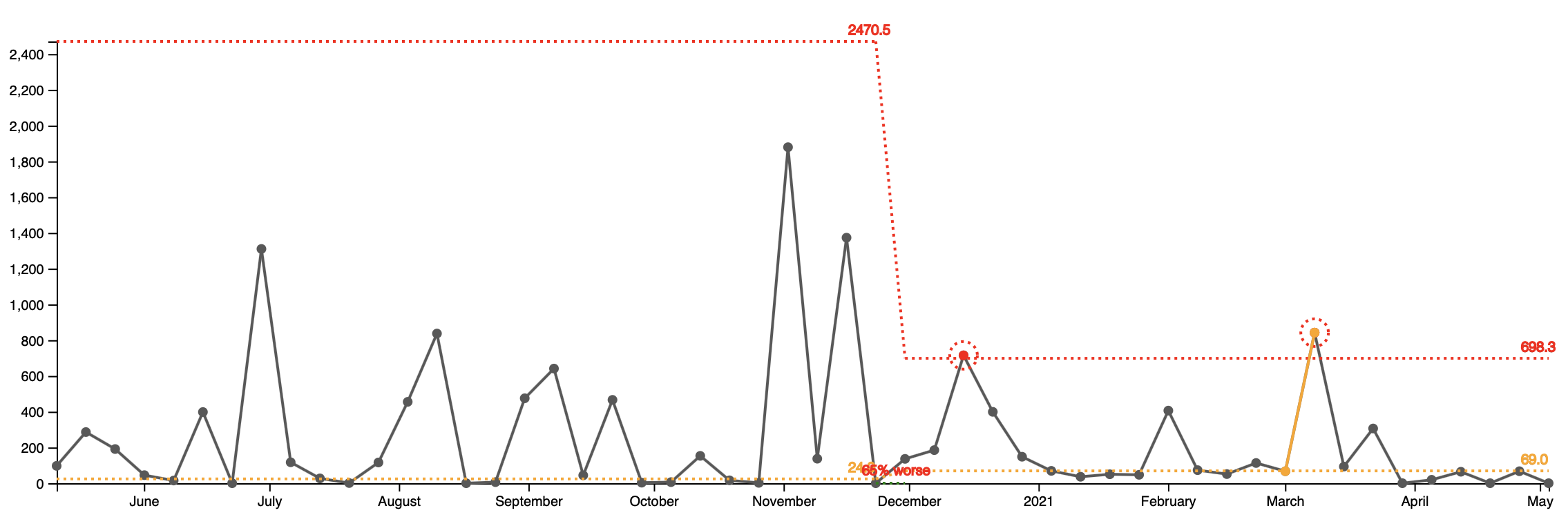
For comparison, here is how a healthy open support tickets graph from another team looks like:
The bottom line? One metric can't tell the whole story. You need multiple ones (checks and balances) to get an acurate picture of the current situation.